The Phantom Connect React SDK provides React hooks for connecting to existing Phantom user wallets in your React apps with native transaction support across multiple blockchains.
Quick start
Generate a new Solana project using the Phantom Embedded React Starter template.
npx -y create-solana-dapp@latest -t solana-foundation/templates/community/phantom-embedded-react
pnpm create solana-dapp@latest -t solana-foundation/templates/community/phantom-embedded-react
yarn create solana-dapp -t solana-foundation/templates/community/phantom-embedded-react
bun create solana-dapp@latest -t solana-foundation/templates/community/phantom-embedded-react
Run the command above in your terminal to get started.
View template on Solana Templates →
Features
- Built for React: Provides React hooks (
usePhantom, useModal) and a provider component for app-level configuration.
- Multi-chain support: Solana (available now), other chains coming soon.
- Connection modal: Built-in, customizable modal for connecting users to Phantom.
- Flexible authentication providers: OAuth (Google, Apple), browser extension, and injected providers.
- User wallet integration: Connects to existing Phantom user wallets using Phantom Connect.
- TypeScript support: Fully typed API surface.
Security
The Phantom Connect React SDK connects to existing Phantom user wallets, ensuring:
- Users control their own wallets and private keys.
- Integration with Phantom’s secure wallet infrastructure.
- No private key handling in your application.
- User maintains full control of their assets.
Prerequisites
- Register your app: Sign up or log in to the Phantom Portal and register your app.
- Obtain your App ID:
- In Phantom Portal, expand your app in the left navigation, then select Set Up.
- Your App ID appears at the top of the page.
- Allowlist your domains and redirect URLs: Add your app’s domains and redirect URLs in the Phantom Portal to enable wallet connections.
Authentication configuration
When using OAuth providers (google, apple), you’ll need to configure authentication options:
authOptions: {
redirectUrl: "https://yourapp.com/auth/callback", // Your callback page
}
Important notes about redirectUrl:
- Must be an existing page/route in your application
- Must be whitelisted in your Phantom Portal app configuration
- This is where users will be redirected after completing OAuth authentication
- Required for google and apple providers
- Not required for injected provider
Installation
npm install @phantom/react-sdk
Dependencies
Install additional dependencies based on the networks you want to support:
| Network support | Required dependencies |
|---|
| Solana | @solana/web3.js OR @solana/kit |
| Ethereum/EVM | viem |
Example for Solana and Ethereum support:
npm install @phantom/react-sdk @solana/web3.js viem
Quick start
import { PhantomProvider, useModal, darkTheme, usePhantom } from "@phantom/react-sdk";
import { AddressType } from "@phantom/browser-sdk";
function App() {
return (
<PhantomProvider
config={{
providers: ["google", "apple", "injected", "deeplink"], // Enabled auth methods
appId: "your-app-id", // Get your app ID from phantom.com/portal
addressTypes: [AddressType.solana, AddressType.ethereum],
authOptions: {
redirectUrl: "https://yourapp.com/auth/callback", // Must be whitelisted in Phantom Portal
},
}}
theme={darkTheme}
appIcon="https://your-app.com/icon.png"
appName="Your App Name"
>
<WalletComponent />
</PhantomProvider>
);
}
function WalletComponent() {
const { open, close, isOpened } = useModal();
const { isConnected, user } = usePhantom();
if (isConnected) {
return (
<div>
<p>Connected</p>
</div>
);
}
return <button onClick={open}>Connect Wallet</button>;
}
Connection Modal
The SDK includes a built-in connection modal UI that provides a user-friendly interface for connecting to Phantom. The modal supports multiple connection methods (Google, Apple, browser extension) and handles all connection logic automatically.
Using the Modal with useModal Hook
To use the modal, pass a theme prop to PhantomProvider and use the useModal() hook to control visibility:
import { PhantomProvider, useModal, darkTheme, usePhantom } from "@phantom/react-sdk";
import { AddressType } from "@phantom/browser-sdk";
function App() {
return (
<PhantomProvider
config={{
providers: ["google", "apple", "injected"],
appId: "your-app-id",
addressTypes: [AddressType.solana, AddressType.ethereum],
}}
theme={darkTheme} // or lightTheme, or custom theme object
appIcon="https://your-app.com/icon.png"
appName="Your App Name"
>
<WalletComponent />
</PhantomProvider>
);
}
function WalletComponent() {
const { open, close, isOpened } = useModal();
const { isConnected } = usePhantom();
if (isConnected) {
return (
<div>
<p>Connected</p>
</div>
);
}
return <button onClick={open}>Connect Wallet</button>;
}
Modal Features:
- Multiple Auth Providers: Google, Apple, browser extension
- Automatic Provider Detection: Shows browser extension option when Phantom is installed
- Mobile Support: Displays deeplink option for Phantom mobile app on mobile devices
- Error Handling: Clear error messages displayed in the modal
- Loading States: Visual feedback during connection attempts
- Responsive Design: Optimized for both mobile and desktop
A ready-to-use button component that handles the complete connection flow:
import { ConnectButton, AddressType } from "@phantom/react-sdk";
function Header() {
return (
<div>
{/* Default: Shows first available address */}
<ConnectButton />
{/* Show specific address type */}
<ConnectButton addressType={AddressType.solana} />
<ConnectButton addressType={AddressType.ethereum} />
{/* Full width button */}
<ConnectButton fullWidth />
</div>
);
}
ConnectButton features:
- When disconnected: Opens connection modal with auth provider options
- When connected: Displays truncated address and opens wallet management modal
- Uses theme styling for consistent appearance
ConnectBox component
An inline embedded component that displays the connection UI directly in your page layout (without a modal backdrop). Perfect for auth callback pages or when you want a more integrated connection experience. The component automatically handles all connection states including loading, error, and success during the auth callback flow.
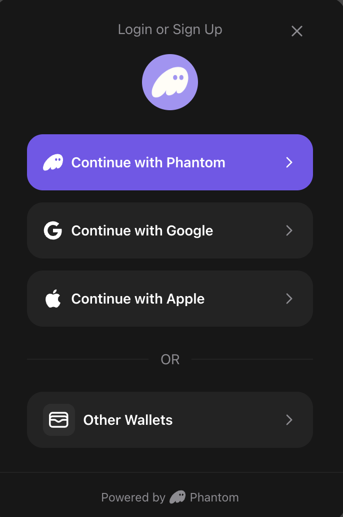
import { ConnectBox } from "@phantom/react-sdk";
function AuthCallbackPage() {
return (
<div>
<h1>Connecting to Phantom...</h1>
<ConnectBox />
</div>
);
}
Props:
| Property | Type | Default | Description |
|---|
maxWidth | string | number | "350px" | Maximum width of the box |
transparent | boolean | false | Removes background, border, and shadow for a transparent appearance |
appIcon | string | — | URL to your app icon (optional, can also be set via PhantomProvider) |
appName | string | — | Your app name (optional, can also be set via PhantomProvider) |
Usage Examples:
import { ConnectBox } from "@phantom/react-sdk";
// Default usage
<ConnectBox />
// Custom width
<ConnectBox maxWidth="500px" />
// Transparent (no background/border)
<ConnectBox transparent />
// Custom width with transparent
<ConnectBox maxWidth={600} transparent />
ConnectBox Features:
- Inline embedded: Renders directly in page flow (not as a floating modal)
- Auto state management: Automatically shows connection/login UI when disconnected, wallet info when connected
- Auth callback support: Handles loading and error states during OAuth callback flows
- No close button: Designed for embedded use cases where users shouldn’t dismiss the UI
- Theme-aware: Uses your configured theme for consistent styling
Use ConnectBox for auth callback pages: When using OAuth providers (Google, Apple), users are redirected to your callback URL after authentication. Place ConnectBox on this page to automatically handle the auth flow completion with proper loading and error states.
Theming
The SDK includes pre-built themes and supports full customization to match your app’s design.
Pre-built themes
Use the included darkTheme or lightTheme:
import { PhantomProvider, darkTheme, lightTheme } from "@phantom/react-sdk";
// Dark theme
<PhantomProvider config={config} theme={darkTheme} appIcon="..." appName="...">
<App />
</PhantomProvider>
// Light theme
<PhantomProvider config={config} theme={lightTheme} appIcon="..." appName="...">
<App />
</PhantomProvider>
Custom themes
Create a custom theme object to fully control the modal’s appearance:
const customTheme = {
background: "#1a1a1a", // Background color for modal
text: "#ffffff", // Primary text color
secondary: "#98979C", // Secondary color for text, borders, dividers
brand: "#ab9ff2", // Brand/primary action color
error: "#ff4444", // Error state color
success: "#00ff00", // Success state color
borderRadius: "16px", // Border radius for buttons and modal
overlay: "rgba(0, 0, 0, 0.8)", // Overlay background color (with opacity)
};
<PhantomProvider config={config} theme={customTheme} appIcon="..." appName="...">
<App />
</PhantomProvider>
| Property | Description | Example |
|---|
background | Modal background color | "#1a1a1a" |
text | Primary text color | "#ffffff" |
secondary | Secondary text, borders, and dividers | "#98979C" |
brand | Brand/primary action color | "#ab9ff2" |
error | Error state color | "#ff4444" |
success | Success state color | "#00ff00" |
borderRadius | Border radius for buttons and modal | "16px" |
overlay | Modal overlay background (supports opacity) | "rgba(0, 0, 0, 0.8)" |
The secondary color must be a hex color value (for example, #98979C) as it’s used to derive auxiliary colors with opacity.
Chain-Specific Hooks
The React SDK provides dedicated hooks for each blockchain:
useSolana hook
import { useSolana } from "@phantom/react-sdk";
function SolanaOperations() {
const { solana, isAvailable } = useSolana();
// Check if Solana is available before using it
if (!isAvailable) {
return <div>Solana is not available for the current wallet</div>;
}
const signMessage = async () => {
const signature = await solana.signMessage("Hello Solana!");
console.log("Signature:", signature);
};
const signAndSendTransaction = async () => {
const result = await solana.signAndSendTransaction(transaction);
console.log("Transaction sent:", result.hash);
};
const switchNetwork = async () => {
await solana.switchNetwork('devnet');
};
return (
<div>
<button onClick={signMessage}>Sign Message</button>
<button onClick={signAndSendTransaction}>Send Transaction</button>
<button onClick={switchNetwork}>Switch to Devnet</button>
<p>Connected: {solana.isConnected ? 'Yes' : 'No'}</p>
</div>
);
}
useEthereum hook
EVM support for Phantom Connect embedded wallets will go live later in 2026.
import { useEthereum } from "@phantom/react-sdk";
function EthereumOperations() {
const { ethereum, isAvailable } = useEthereum();
// Check if Ethereum is available before using it
if (!isAvailable) {
return <div>Ethereum is not available for the current wallet</div>;
}
const signPersonalMessage = async () => {
const accounts = await ethereum.getAccounts();
const signature = await ethereum.signPersonalMessage("Hello Ethereum!", accounts[0]);
console.log("Signature:", signature);
};
const sendTransaction = async () => {
const result = await ethereum.sendTransaction({
to: "0x742d35Cc6634C0532925a3b8D4C8db86fB5C4A7E",
value: "1000000000000000000", // 1 ETH in wei
gas: "21000",
});
console.log("Transaction sent:", result.hash);
};
const switchChain = async () => {
await ethereum.switchChain(137); // Switch to Polygon
};
return (
<div>
<button onClick={signPersonalMessage}>Sign Personal Message</button>
<button onClick={sendTransaction}>Send Transaction</button>
<button onClick={switchChain}>Switch to Polygon</button>
<p>Connected: {ethereum.isConnected ? 'Yes' : 'No'}</p>
</div>
);
}
Supported EVM Networks:
| Network | Chain ID | Usage |
|---|
| Ethereum Mainnet | 1 | ethereum.switchChain(1) |
| Ethereum Sepolia | 11155111 | ethereum.switchChain(11155111) |
| Polygon Mainnet | 137 | ethereum.switchChain(137) |
| Polygon Amoy | 80002 | ethereum.switchChain(80002) |
| Base Mainnet | 8453 | ethereum.switchChain(8453) |
| Base Sepolia | 84532 | ethereum.switchChain(84532) |
| Arbitrum One | 42161 | ethereum.switchChain(42161) |
| Arbitrum Sepolia | 421614 | ethereum.switchChain(421614) |
| Monad Mainnet | 143 | ethereum.switchChain(143) |
| Monad Testnet | 10143 | ethereum.switchChain(10143) |
Auto-Confirm Hook (Injected Provider Only)
The SDK provides auto-confirm functionality that allows automatic transaction confirmation for specified chains.
useAutoConfirm hook
import { useAutoConfirm, NetworkId } from "@phantom/react-sdk";
function AutoConfirmControls() {
const {
enable,
disable,
status,
supportedChains,
isLoading,
error,
} = useAutoConfirm();
const handleEnable = async () => {
// Enable auto-confirm for specific chains
const result = await enable({
chains: [NetworkId.SOLANA_DEVNET, NetworkId.ETHEREUM_MAINNET]
});
console.log("Auto-confirm enabled:", result);
};
const handleDisable = async () => {
await disable();
console.log("Auto-confirm disabled");
};
return (
<div>
<p>Status: {status?.enabled ? "Enabled" : "Disabled"}</p>
<button onClick={handleEnable} disabled={isLoading}>
Enable Auto-Confirm
</button>
<button onClick={handleDisable} disabled={isLoading}>
Disable Auto-Confirm
</button>
</div>
);
}
Wallet Discovery Hook
useDiscoveredWallets
Get discovered injected wallets with automatic loading and error states. Discovers wallets using Wallet Standard (Solana) and EIP-6963 (Ethereum) standards.
import { useDiscoveredWallets } from "@phantom/react-sdk";
function WalletSelector() {
const { wallets, isLoading, error, refetch } = useDiscoveredWallets();
if (isLoading) {
return <div>Discovering wallets...</div>;
}
if (error) {
return <div>Error discovering wallets: {error.message}</div>;
}
return (
<div>
<h3>Available Wallets</h3>
{wallets.map((wallet) => (
<div key={wallet.id}>
<img src={wallet.icon} alt={wallet.name} width={24} />
<span>{wallet.name}</span>
</div>
))}
<button onClick={refetch}>Refresh</button>
</div>
);
}
Returns:
| Property | Type | Description |
|---|
wallets | InjectedWalletInfo[] | Array of discovered wallet information |
isLoading | boolean | true while discovery is in progress |
error | Error | null | Error object if discovery fails |
refetch | () => Promise<void> | Function to manually refresh the wallet list |
SDK Initialization
The SDK provides an isLoading state to track when initialization and autoconnect are in progress:
import { useConnect, usePhantom } from "@phantom/react-sdk";
function App() {
const { isLoading } = usePhantom();
const { connect } = useConnect();
// Show loading state while SDK initializes
if (isLoading) {
return (
<div>
<h1>Initializing Phantom SDK...</h1>
<p>Please wait...</p>
</div>
);
}
// SDK is ready
return (
<div>
<h1>Welcome!</h1>
<button onClick={() => connect({ provider: "injected" })}>
Connect Wallet
</button>
</div>
);
}
Debug Configuration
Configure debug logging by passing a debugConfig prop to PhantomProvider:
import { PhantomProvider, DebugLevel } from "@phantom/react-sdk";
function App() {
const [debugMessages, setDebugMessages] = useState([]);
const debugConfig = {
enabled: true,
level: DebugLevel.INFO,
callback: (message) => {
setDebugMessages((prev) => [...prev, message]);
},
};
return (
<PhantomProvider config={config} debugConfig={debugConfig}>
<YourApp />
</PhantomProvider>
);
}
Debug configuration properties:
| Property | Type | Description |
|---|
enabled | boolean | Enable debug logging |
level | DebugLevel | Debug level (ERROR, WARN, INFO, DEBUG) |
callback | (message: DebugMessage) => void | Custom debug message handler |
Available hooks
| Hook | Purpose | Returns |
|---|
useModal | Control the connection modal | { open, close, isOpened } |
usePhantom | Access wallet/user state | { isConnected, isLoading, user, wallet } |
useConnect | Connect to wallet | { connect, isConnecting, isLoading, error } |
useAccounts | Get wallet addresses | WalletAddress[] or null |
useIsExtensionInstalled | Check extension status | { isLoading, isInstalled } |
useDisconnect | Disconnect from wallet | { disconnect, isDisconnecting } |
useAutoConfirm | Auto-confirm management (injected only) | { enable, disable, status, supportedChains, ... } |
useDiscoveredWallets | Get discovered injected wallets | { wallets, isLoading, error, refetch } |
useSolana | Solana chain operations | { solana, isAvailable } |
useEthereum | Ethereum chain operations | { ethereum, isAvailable } |
useTheme | Access current theme | PhantomTheme |
What you can do
Starter kits and examples
Get started quickly with production-ready React templates:
Additional resources